I have a blog so that i can update it about what me and my group are doing in our advanced portfolio in media studies which is a music video.
Saturday, 21 April 2012
Final Ancillary Tasks
Below i have add images of my final lanyard and music magazine advert.
I like my ancillary tasks. I think they are very basic however this is a good thing as it gives it that urban theme and attracts the audience because all the information needed isn't all crammed on. I really like the colour scheme we chose, i think its a little depressing meaning it finds in with the theme of isolation from the music video. I used a shot from the studio photo shot so that there is a bit of variety plus because it is promoting the tour and therefore has nothing to do with the single.
 |
| Music Magazine advert |
 |
| Front of Lanyard |
 |
| Back of my Lanyard |
Friday, 20 April 2012
Question 4: How did you use new technologies in the construction, research, planning and evaluation stages?
We used lots of technologies throughout every stage of this
project, some new, some old. With the technologies I’d already used before I
was able to develop my skills and become more confident when using them.
Research &
planning (pre – product)
Before starting our music video I
did some research into exiting real media video including analysing the real
music video for ‘The Man Who Can’t Be Moved’, along with other music videos from
bands such as ‘The Fray’ as they are the same genre as The Script. I also
looked at their social networking sites and read some of the comments to see
what the fans like about their music and the bands official music videos so
that we can add that in to our video to make it more appealing to the audience.
We also storyboarded and took notes using Microsoft PowerPoint. For my ancillary
task I used the internet to look at the script’s website (http://www.thescriptmusic.com/gb/home/),
but not only did I look at bands website that are similar to ‘The Script’
including Muse (http://muse.mu/) but I also
looked at some pop artist as well such as Jessie J (http://jessiejofficial.com/) I did this
so that I could get the best possible research, that way I can pick up elements
from music website in generally. I also used the internet for the research of
my advert and lanyard with Google images.
Construction (production)
In the production stage most of it
was done using technologies. We filmed the actual video on a Sony Handycam camera.
After doing that we uploaded on to the video editing machines using PMB that
software also converted the clips into WMA format. We actually edited all the
footage in Premier Pro, instead of importing all the clips into premier pro we
viewed them in windows media player first, this also helped us so that we knew
when we were going to cut it when we finally imported it into premier pro. I
learnt a lot of new skills in Premier Pro for example about adding key frames
to add movement to each shot, throughout the music video we only used one kind
of visual transition which was a cross dissolve, I learnt how much more
professional videos looked when only one transition is used. When filming the
band and lead male singing shots I brought my Bose SoundLink Wireless Mobile
Speakers and played the song through my iPhone, this helped when it came to
editing the lip-syncing together. For
our ancillary tasks we had two photo shoots, one on location the other in the
studio. When on location we used a Canon Powershot camera and in the studio I
used another digital camera. To actually create my ancillary tasks i used three
Adobe CS3 software’s altogether. They are: Photoshop for the advert, lanyard, and
website banner and also for editing images. Dreamweaver for the actual webpages
and the rollover buttons for the website were created in Flash. The biggest
skill I learnt while using the software’s was that I now know how to add YouTube
videos in to Dreamweaver, I gained this new skill from trial and error and also
YouTube tutorials. As well as using YouTube for tutorials it was also very
useful as the little behind the scenes videos needed to be uploaded on to YouTube
first before the short videos can be posted on Blogger. I also created a
Prezzie to show the development and draft work of my ancillary tasks. Below is a short video of my filming one of the flashbacks in Greenwich using the Sony Handycam.
Evaluation (post product)
I got a variety of people to
evaluate our music video, all of the reviews where filmed on different cameras,
I think this is a good thing has I have the ability and skills to use a variety
of cameras correctly, and for example one camera I used was a Samsung Schneider
Kreuznach. We also had a Creative arts evening where our video was shown on the
big screen to an audience, after we set up a little booth and recorded people’s
reactions to the video we used the same cameras we shot the actual video on which
was a Sony Handycam. On the same camera the three of us did a piece to camera
analysing our music video. I recorded a shot video on my iPhone about my
ancillary tasks.
Wednesday, 18 April 2012
Question 3: What have you learned from your audience feedback?
Above i have madjhje a wordle of feedback that i got from a variety of people through word and mouth. The make thing that i learnt was the it was very relatable due to the strong structure of the narrative. The editing at the end was liked by most people as it got them really thinking about the song and its lyrics. People also really liked the flashbacks as it made them think of their past relationship so they can empathise with the lead male.The split screens were effective according to our audiences as it showed that the characters were now living two separate lives. I personally only got one bad criticise and that was that it was a bit slow and boring meaning the editing could have been improved.
As well as just talking to people at the music video, i recorded some peoples reactions, to back up our reception theory. Below i have posted one of the people i recorded. She is the type of audience we were going for as she can relate to both characters for example trying to move on after a brake up but also missing a boy so much she'd do anything to have him back.
As well as just talking to people at the music video, i recorded some peoples reactions, to back up our reception theory. Below i have posted one of the people i recorded. She is the type of audience we were going for as she can relate to both characters for example trying to move on after a brake up but also missing a boy so much she'd do anything to have him back.
Tuesday, 17 April 2012
Monday, 16 April 2012
Question 1: In what ways does your media product use, develop or challenge forms and conventions of real media products?
Our music video uses forms and conventions of real media products. For example it features band shots, shots of the lead singer and a good structured narrative. While doing my research I found that every music video either has the band performing or the lead artist singing to the camera. We knew from the start that we wanted to have a very strong narrative in our video. This is because ‘The Script’ always has excellent narratives to go along with the music. On YouTube all of their official music videos are about 5 minutes long as they have a lot of narrative in the video it make it more interesting for the audience. We wanted to do that with our video especially because it is such an emotional song and we had lots of creative ideas.
The video has lots of conventions, such as iconic locations, by doing this the audience can understand the locations helping them understand the video better. In the real video for the song the band shots were filmed in an abandoned car park, we wanted to portray this in ours so chose for ours to be filmed in an isolated building estate in Woolwich on a Sunday.
The mise–en-scene used is the same in both videos for example, the costume our lead male was wearing is the same as Danny O'donoghue and by this I mean, it was dark, had a hood for the rain, and looked like a tramp however we know he isn’t a tramp from the song lyrics. There was only natural light used to make it look realistic. We also had the same props, our lead male has a sleeping bag through some of the video the same as Danny O'donoghue has as well.
The themes in video are very conventional; most songs these days are about a past relationship or a brake up. So the themes are isolation, harsh reality and moving on. Isolation because of the band shots and emotionally the man is now alone, the girl & this band have gone. Harsh reality is a big thing because people are always thinking about their pervious relationship (the flashbacks) and miss it. It is obvious that the girl broke up with the man and she is now trying to move on and forget about him by being with her friends, this is also part of reality.
However we have challenged conventions in our music video. I don’t think I have ever seen a music video for a band that has shots of them performing and of the lead singer singing not in the narrative, I do feel this elaborates the isolation theme though. In the real music video they didn’t use a variety of shots when filming the band; however they did have a timelapse unlike us. So to make it more interesting we used a number of variety of shots, the reason we never used a timelapse was because we wanted to keep the editing basic, to make it more urban and simple.
Overall I feel our video was very conventional and we stuck to the lyrics.
Sunday, 15 April 2012
Analysing the music video
Below is a piece to camera the three of us did, where we explained everything to do with our video, for example the themes and our thoughts behind the creative process.
Saturday, 14 April 2012
Ancillary Task development
Development of my Ancillary Tasks. on Prezi
I made a prezi presentation so that it was easier to see my development
Friday, 13 April 2012
Editing
I have left blogging about editing to the last minute as it is the longest process of the whole project. I’ve had so much fun doing the editing process. The three of us worked well together and we had lots of creative ideas. We started editing as soon as we did our first day of filming back in November. We did encounter a few problems when editing for example where the song is quite slow and emotional it was hard to get a good balance of slow and sad shots that captured the lead male’s emotion with short shots with lots of movement to make it interesting for the audience. I think the narrative helped with this, the slow shots were going to be of Jamie and then the fast handheld shots of the female running. I think the editing is very basic so that it shows the raw emotion and realistic side to the video. However every shots needed movement which we did, I soon started to realise how much better this made the video. We had the black and white Idea for the flashbacks right at the start, with one of the flashbacks we was going to make the lead females umbrella red however we realised we would have to do that more than one to make it a motif. We do have one editing motif however and that is a three way split screen which we used three times. By doing the split screens we was able to make the video more interesting and make the tempo faster, it also helped show the narrative better. One of my favourite parts of the video is the ending, the ending there is very basic but looks very effective. All we did was took two shots and faded them into each other using key frames.
Saturday, 24 March 2012
Behind The Scenes
As well as making the actual video we took images and video of the behind the scenes. In the video below we have just put in altogether with the song playing in the background. The content is from a variety of shoots we did in Greenwich and when we shot the band shots in Woolwich.
Wednesday, 21 March 2012
Creative Arts Evening
Last night on the 20/03/12 we had a arts and media evening at our school for sixth form, this involved people buying a ticket and coming to see the Media music videos that had been produced along with Photography, dance. music ect that was all displayed. Overall i think it went very well for our group everyone we asked loved our video and gave us feedback which i shall included in a wordle on evaluation question number 3. I was very nervous before our video got shown on the big screen for a number of reasons, mostly because the audience were mostly parents and we'd not really got their feedback before about anything to do with the project. However they gave the best feedback i think as they said it brought back a sense of nostalgia with all the memories of there first love, especially because of the black and white flashbacks and good structured narrative.
Below is an image of Me, Gemma and Luke, giving a little presentation to the audience for the video was shown explaining what it was about.
Below is an image of Me, Gemma and Luke, giving a little presentation to the audience for the video was shown explaining what it was about.
Sunday, 11 March 2012
Re - Shoot
Recently we went back to Greenwich to do some filming to improve our video, this is because of some of the critical feedback we got the other day. While in Greenwich we filmed more flashbacks from a variety of locations of Gemma and Jamie's past relationship, hopefully by doing this the audience will understand their relationship and why the lead male is still in love with her and misses her by showing he is willing to sit on the corner where they met waiting for the girl.
We also filmed some more of the lead male sitting on the corner. The weather wasn't great as it was raining however i feel this shows just how long he is willing to sit there for plus it fits with the lyric 'gotta stand my ground even if it rains or snows'. The main reason we filmed more of Jamie just sitting on the corner was because we need to show the time he'd been there for, so the weather helped, we brought and rucksack and sleepingbag to make it more realistic, we also filmed more just naturally of people walking past and Jamie looking around anxious waiting for his girl, we can up with the idea of maybe adding in a time lapse to show movement and time flying past Jamie while he still waits patiently.
One other thing we just decided to re - shot amount ourselves was the scene outside Bexleyheath library where the lead female is given the newspaper by one of her friends. This was purely because a tripod wasn't used the first time round meaning is as a bit shaky. Now it is smooth and will be more enjoyable for the audience to watch and look more professional.
Thursday, 8 March 2012
Video feedback
Recently we showed our music video to the rest of our media class (who can be part of the target audience due to the age of them). The overall feedback was positive and we saw the way people reacted to the video. Majority of them felt sorry for the lead boy which is the reception theory we were aiming for. Some boys also admitted to a sense of nostalgia as they had been through what the guy was emotional feeling. The audience liked that we have pushed any conventions with the video and how followed the lyrics closely making it easier to understand the narrative and concept of the video. Some critical feedback mentioned are listed below:
- There isn't enough flashbacks about the couples previous relationship. By doing this it will be easier for the audience to understand how much the girl means to the boy and that he can't get over her.
- Not enough band shots from the start of the video.
- We need to use the split screen effect more so that it becomes a motif.
- Some of the shots are too long and can be very boring, so we need to cut some of the clips shorter to up the tempo of the video.
- It needs to seem like the lead boy has been waiting for the girl for a long time so someone suggested that he have a sleeping bag with a sign and a big picture of Gemma, this will also fit with the lyrics.
Wednesday, 7 March 2012
Final ancillary drafts
After a lot of thought and feedback from our members in my group, i have decided to use my draft design one's for my ancillary tasks. This is because i feel that the first draft i come up with are the ones i really believe in. My creativity skills are tested to try and create two or three more designs after all my passion and initial ideas went into my very first draft. I think my first designs are the strongest and show what layout and content i was trying to portray the best.
Friday, 2 March 2012
Ancillary photography (studio)
On Friday (24/2/12) i went into the studio with the band to take some more photography for our ancillary By taking some more images it gives us more options and makes the ancillary tasks look more interesting.
Thursday, 1 March 2012
Feedback for my ancillary tasks
Today i got feedback from the rest of my group and from my teachers. There were a few improvements that i personally needed to do but also as a group, these include:
- A different font on my music magazine advert. As the font verdana is to professional and doesn't go with our urban theme. It also shouldn't be used on adverts as it isn't easy on the eye and wont persuade the audience to buy the single.
- We all need to decided on the style of the font for 'The Script' so that they are all the same. For example Gemma put a lot of stroke on her text, i only had it a little bit whereas Luke didn't put any on, so that it becomes part of our codes and conventions.
- I also need to include a copyright paragraph on all of my products, to make them more conventional to real media texts.
I am grateful for all the feedback and shall get on with editing my ancillary tasks according to the improvements.
Sunday, 29 January 2012
Filming of the lead singer
So far we have only filmed the narrative side of the video. After looking back at the footage we took the other day at Woolwich of our band, we have decided that we need more footage of the lead boy singing on his own. By doing this we will create a good balance between the narrative of the video and the band/lead singer. The location of which we would film in. Luke wanted to film it on a black background in the studio however me and Gemma felt filming it outside would be better as it fits the mise-en-scene of the video appropriately. We all decided that filming Jamie singing by himself would be a great idea, this shows isolation which is a key emotion we are trying to portray as a conventional emotion.
Wednesday, 25 January 2012
Ancillary photography (location)
While Luke and I filmed the band shots in the industrial estate, Gemma took some images to use when creating our ancillary tasks. We tried to use different angles are surrounds so that the photograph is varied and we have more to work with. I have posted some of the images below:
Tuesday, 24 January 2012
Filming the band shots
On Sunday (22/1/12) we filmed the band shots for our music video. The location we picked was an industrial estate in Woolwich. We thought the location was suitable because it fits with the urban, isolated and abandoned theme. Another reason we chose the estate was because of the varied shots we could get from it, for example there were a few flights of stairs near so we used them for high angled shots. We were planning on using the dolly while filming but sadly couldn't because the ground wasn't flat enough, however we came up with another way which i filmed which was me filmingh the band as Gemma's dad drove the car. We took shots of the band as a group but also separate shots of the members playing their instruments, Jamie (main male) also sang for some parts. Below are some images of what happened.
 |
| filming from a high angled on the stairs |
 |
| Location Scouting |
 |
| filming from a high angle on top of a building |
 |
| location scouting |
Friday, 13 January 2012
Ancillary task (magazine advert & lanyard drafts)
For my ancillary tasks i am creating a website in Adobe Dreamweaver. As well as Dreamweaver i am using Photoshop to create a music magazine advert and a lanyard. I have done three designs for each. The advert and lanyard drafts are below:
 |
| Design one - advert |
 |
| Design one - Lanyard |
 |
| Design two - lanyard |
 |
| Design two - advert |
 |
| design three - lanyard |
 |
| design three - advert |
Thursday, 12 January 2012
Ancillary task (website drafts)
I have decided to create four pages in Adobe Dreamweaver for my website. In total i have done three drafts each having a slightly different layout.
Design one
 |
| Homepage |
 |
| Bio Page |
 |
| Gallery page |
 |
| Tour page |
Design two
 |
| homepage |
 |
| bio page |
 |
| gallery page |
 |
| tour page |
Design three
Tuesday, 10 January 2012
Storyboard
This is the storyboard my group and i have been following when filming. By having a storyboard it keeps us organised, we also know exactly what we are filming so that we don't wait time. Of course if we get to the location and some has an idea, we film the shots on the storyboard then have a 'freestyle' section where recording other intresting shots that we think may look good. For example when filming the band shots at location there were stairs so we used them and got some high angled shots.
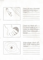 |
| Page 1 |
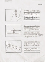 |
| Page 2 |
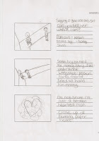 |
| Page 3 |
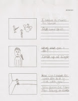 |
| Page 4 |
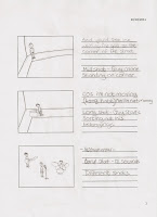 |
| Page 5 |
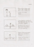 |
| Page 6 |
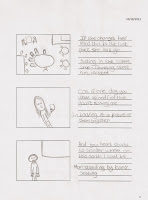 |
| Page 7 |
| Page 8 |
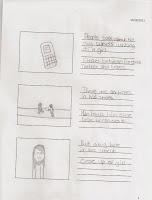 |
| Page 9 |
| Page 10 |
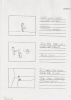 |
| Page 11 |
| Page 12 |
| Page 13 |
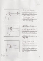 |
Page 14
|
Page 15
|
Subscribe to:
Comments (Atom)


